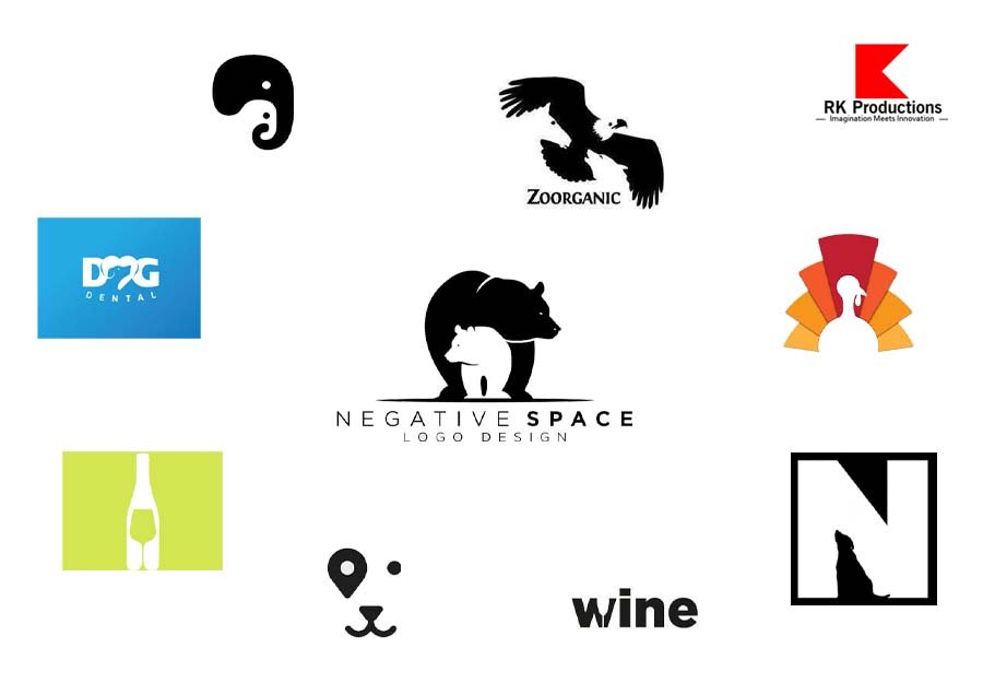
In a crowded visual world, creating a memorable logo is more challenging—and more important—than ever. Negative space, the “blank” or unused space surrounding or within logo elements, has emerged as a powerful tool for designers to craft logos that not only look visually appealing but are also meaningful and memorable. In this post, we’ll explore how negative space can elevate logo design, review famous examples, and share tips for creating logos that leverage negative space to make a lasting impression.
What Is Negative Space in Logo Design?
Negative space, also known as “white space,” refers to the empty or unused areas in a design that surround and complement the main elements. In logo design, negative space can be used creatively to form secondary images, add depth, and communicate hidden messages. By skillfully incorporating negative space, designers can create logos that tell a story, invite curiosity, and build a strong brand identity.
Why Use Negative Space in Logo Design?
- Creates Depth and Intrigue: Negative space adds an element of surprise and intrigue, inviting viewers to look twice and explore the hidden details. This creates a memorable experience that makes a logo stand out.
- Enhances Simplicity: Logos with well-used negative space are often minimalistic and clean, making them easily recognizable and versatile across various applications.
- Communicates Brand Story: A well-thought-out negative space logo can cleverly convey a brand’s message or core values without additional words or elements.
Famous Examples of Negative Space Logos
Several iconic brands have successfully utilized negative space in their logos to communicate more with less:
- FedEx: Perhaps the most famous example, FedEx’s logo has an arrow in the negative space between the “E” and “x,” symbolizing speed and forward movement, which aligns perfectly with the brand’s focus on delivery.
- WWF (World Wildlife Fund): WWF’s logo cleverly uses negative space to depict a panda, highlighting the organization’s dedication to wildlife preservation.
- Baskin-Robbins: Known for its 31 flavors, Baskin-Robbins’ logo uses the pink segments within the “B” and “R” to subtly reveal the number 31, adding a playful twist to the design.
- Formula 1 (F1): The F1 logo has a hidden “1” in the negative space between the “F” and the red stripes, symbolizing speed and motion.
These logos are memorable not only for their simplicity but also for their cleverness, inviting viewers to find hidden messages within the design.
How to Incorporate Negative Space in Logo Design
1. Identify Core Values and Key Messages
- Start by defining the brand’s mission, vision, and core values. A meaningful logo often aligns with the brand’s purpose, and incorporating these elements into the design can result in a logo that resonates with the audience on a deeper level.
2. Think in Layers
- Negative space designs often feature two layers: the primary symbol and a secondary image within the negative space. Sketch out different shapes and see how they might interact with one another to create both layers.
3. Use Simple Geometric Shapes
- Negative space logos are most effective when they’re simple and easily recognizable. Using basic shapes—circles, triangles, or lines—makes it easier to form recognizable images in the negative space without overcomplicating the design.
4. Experiment with Typography
- Letter-based logos are perfect for experimenting with negative space. Try removing or altering parts of letters to reveal hidden shapes or messages. For example, creating subtle silhouettes or adding small details within letter gaps can add depth without overcrowding the design.
5. Balance Between Positive and Negative Space
- Achieving a perfect balance between positive (filled) and negative space is essential. Too much negative space can make the logo feel empty, while too little may make it feel cluttered. Aim for harmony that lets the secondary elements shine subtly.
6. Test the Design at Various Sizes
- A successful logo design must be scalable. Test the negative space logo in different sizes to ensure that it remains legible and impactful even when resized.
7. Get a Second Perspective
- Negative space logos are meant to reveal hidden elements, so it’s helpful to show the design to others to gauge their reaction. A fresh set of eyes can often spot elements or add insights that help refine the design.
Advantages of Using Negative Space in Logo Design
- Memorability: Hidden messages and clever design often make logos more memorable.
- Versatility: Negative space logos are typically simple and minimalistic, making them easy to reproduce across different media.
- Professional Appeal: Brands with negative space logos often appear sophisticated, thoughtful, and innovative.
Final Thoughts
Negative space in logo design is not just about filling empty areas; it’s about making every element count. When used effectively, negative space transforms a logo from a simple symbol into a dynamic brand storyteller. By blending creativity with simplicity, designers can craft logos that not only represent the brand but also engage and intrigue viewers.
In an age of visual noise, a well-crafted negative space logo can make a brand stand out—memorable for both its visual appeal and the deeper meaning within. Whether you’re designing your own logo or seeking inspiration, negative space might just be the key to unlocking a truly iconic brand identity.


